AI answer tracking is the new SEO ranking report. Growth teams run prompts and log citations, mentions, recommendations, and source selections.
That’s where the reporting risk starts.
The good news is that you can see more than before. You can see whether an answer cites, mentions, or recommends a brand, how it frames that brand, and which sources support the answer.
The bad news is that AI answers shift fast. Models update, sources change, competitors move, retrieval paths change, and fan-outs can pull in a different set of supporting queries.
Visibility may improve because of your work. But it may also improve because the system rebuilt the answer from different inputs.
So the question isn’t, “Did we become more visible?”
It’s, “Did our work cause the change?”
If you can’t answer that, you may credit movement you didn’t cause, scale the wrong campaigns, and build the next round of strategy on bad data.
AI search changed the unit of visibility
Traditional SEO measurement gave teams a familiar scorecard: rankings, traffic, and conversions. Those are still important, but AI search adds a different visibility problem.
You need to know where a page ranks AND how the brand appears in the answer:
- Are we cited?
- Are we mentioned?
- Are we recommended?
- Which sources were selected to support the answer?
- What did the answer actually say about us?
- How are we being framed relative to competitors?
A blue link ranking still matters. But an AI answer isn’t a blue link…
It’s built from sources, shaped by retrieval, and influenced by the system’s understanding of the topic. The final answer may include citations, brand mentions, recommendations, and descriptive framing.
Google describes AI Overviews and AI Mode as experiences that can surface links and use query fan-out across subtopics and data sources.
That alone should change how you think about visibility.
You’re tracking rankings while also tracking how AI assistants use a brand, website, and source ecosystem to construct an answer.
Before you measure AI visibility, you need to define what changed.
Step 1: Name the layer
Before you report that AI visibility improved, you need to name what improved.
“Showed up” isn’t a clean metric.
A page can be cited while the brand gets ignored. A brand can be mentioned in passing, recommended with caveats, grouped with the wrong competitors, or framed in a way that weakens its position.
That’s why you need to separate AI visibility into four layers:
- Citation visibility
- Mention visibility
- Recommendation visibility
- Framing visibility
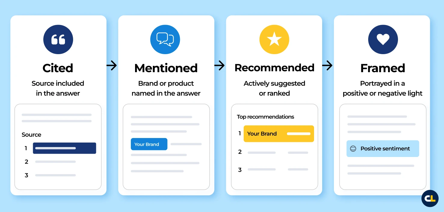
Each layer tells you something different and points to different work.
Citation visibility
A citation means the answer used or referenced a source.
That source could be your website, a third-party article, a competitor page, a review page, or a page that mentions your brand. It could also be a source that doesn’t mention you at all.
That’s why citation visibility can mislead.
Your site can appear as a source, even if the answer ignores the brand. A third-party page that includes you can get cited while the model uses it to support a broader category claim and leaves you out.
The AI answer cited the source, but the brand still didn’t make it into the answer.
Before reporting citation visibility as progress, check:
- Was our site cited?
- Was a third-party source that mentions us cited?
- Did the cited source support a claim we care about?
- Was the citation attached to a useful part of the answer?
- Did the citation lead to a mention, or were we cited but ghosted?
Mention visibility
A mention means the brand appears in the answer—useful, but not the full story.
The brand may be named in passing, buried in a long list, grouped with the wrong competitors, or tied to a use case that’s too narrow, outdated, or low-value.
Before you report mention visibility as progress, check:
- Was the brand named?
- Was it named in a relevant context?
- Was it grouped with the right competitors?
- Was it tied to the right use case, product, service, or category?
- Was the mention specific enough to help?
Recommendation visibility
A recommendation means the system actively suggests the brand as an option.
That usually gets closer to commercial value, especially when users compare vendors, tools, schools, products, services, or agencies.
But getting recommended doesn’t mean getting recommended well.
One answer may make the brand the clear choice. Another may bury it, qualify it, or give competitors stronger language.
Before you report recommendation visibility as progress, check:
- Were we recommended?
- Where did we appear in the recommendation set?
- Were we first, top three, or buried?
- Did the answer recommend us confidently?
- Did competitors get cleaner or stronger language?
Framing visibility
Framing is how the answer describes the brand.
This is where visibility looks like progress while still creating a positioning problem.
A brand can be cited, mentioned, and recommended, but still get weak language, outdated descriptors, caveats, or competitor-favorable framing.
The answer may include the brand, but describe it in a way that limits its value or weakens its position.
Before you report framing visibility as progress, check:
- Are we described accurately?
- Are we positioned as a leader?
- Are important descriptors missing?
- Are we associated with the right strengths?
- Are we described with outdated information?
- Are competitors described more clearly?
Step 2: Measure presence vs. prominence
Once you name the layer, measure presence and prominence.
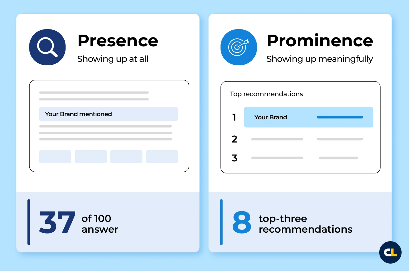
Presence tells you whether the brand appeared. At the answer level, it’s binary. The brand either shows up or it doesn’t.
Across a prompt set, presence becomes a rate. If the brand appeared in 37 of 100 tracked answers, the presence rate is 37%.
Prominence tells you how much weight that appearance carries.
Prominence is less binary. It shows up in the strength of the placement, the confidence of the language, the relevance of the context, and the quality of the citation or framing. A brand can appear in 37 answers and still have weak visibility if the answer barely uses it.
Presence gets you into the answer. Prominence tells you whether being there helps.
Apply both questions to the layer you’re measuring:
| Layer | Presence Question | Prominence/Quality Question |
|---|---|---|
| Citation | Are we or target sources cited? | Do citations support the claims we care about? |
| Mention | Is the brand named? | Is it named in the right context? |
| Recommendation | Are we included? | Where do we rank? |
| Framing | Are we described? | Is the description accurate, current, and helpful? |
This is the danger of rushing to one big ‘AI visibility score’ too early.
A score and dashboards can be useful. We built Xofu because manual tracking quickly becomes tedious, especially across brands, competitors, prompts, citations, mentions, recommendations, and dates.
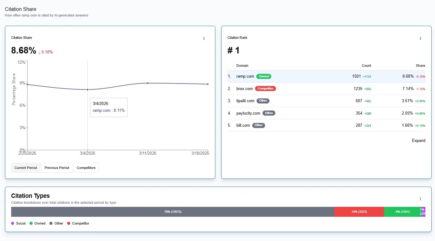
But if the number changes and you don’t know which layer it moved in, you don’t know what happened. Naming the layer gives direction to the work.
Presence and prominence show whether the brand appeared and whether that appearance carried weight.
Why answer tracking gets messy
AI answers are built from moving inputs.
The answer you see is downstream of prompts, query fan-outs, retrieval systems, source sets, SERPs, competitors, and model synthesis.
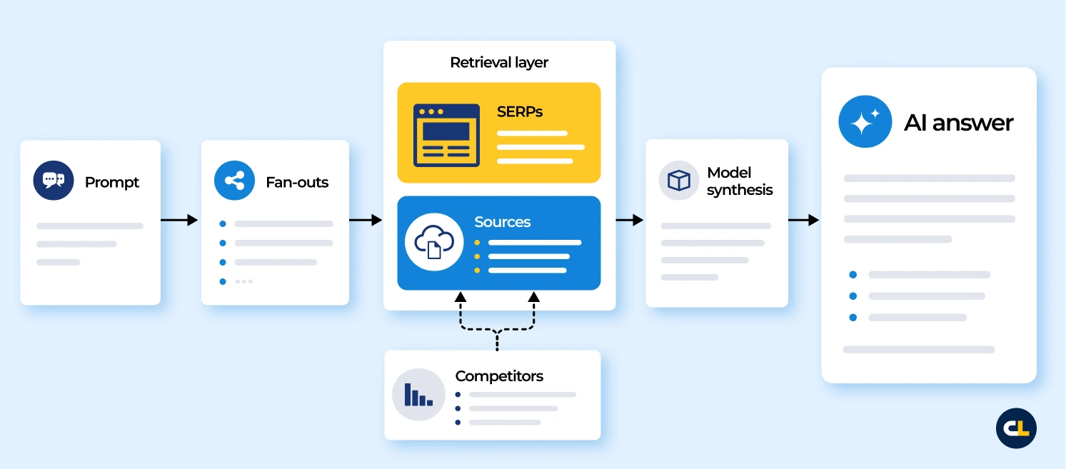
When visibility changes, there are several possible explanations:
- The campaign worked
- A competitor improved or dropped out
- The source set changed
- The model started favoring a different kind of source
- The SERP changed underneath the answer
- The retrieval path or supporting queries shifted
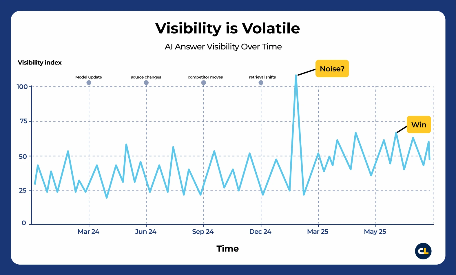
This is why movement isn’t the same as impact. You can see the output, but you often have to infer which input changed.
That doesn’t mean tracking is pointless. It means you need to be careful.
The problem isn’t that you can’t measure anything. The problem is that you can measure a lot, then over-believe what you measured.
The dashboard gives you confidence—not causation.
Query fan-outs explain weird movement
Query fan-outs are one reason AI answer movements can feel weird.
You may be tracking a single prompt, but the answer may be influenced by many supporting queries or information needs.
For example, a prompt like “best software for enterprise SEO teams” may pull from searches around pricing, features, reviews, alternatives, integrations, enterprise use cases, scalability, customer support, security, and comparison pages.
So you think you’re tracking one prompt.
But the system may be building the answer from a whole ecosystem of related queries, rankings, sources, and citations.
Google has described query fan-out as a technique used by AI Mode, where the system breaks a question into subtopics and issues multiple queries simultaneously. Google’s Search Central documentation also says AI Overviews and AI Mode may use query fan-out across subtopics and data sources to develop a response.
There are also starting points for exploring this manually. Michael King and the iPullRank team released Qforia, an open-source query fan-out prediction tool that simulates how one query may expand into related synthetic queries for AI search surfaces. It’s not a perfect view into what Google or any AI system ran, but it’s a useful way to think through the supporting questions that may shape an answer.

That’s why the answer can change even if you didn’t directly change anything for the main prompt.
Your content may be strong for the main category, but weak for the supporting criteria the system uses to decide who belongs in the answer.
This is where content structure becomes relevant.
I’m not saying you should restructure websites only for AI systems. That’s usually a bad starting point. But if your best evidence is buried in a vague page or scattered across content that doesn’t clearly connect the brand to the relevant use case, feature, audience, or proof point, don’t be shocked when AI answers miss it.
“Chunkifying your content” isn’t a strategy by itself. You don’t need to turn every content discussion into an LLM feeding exercise.
But clear organization still matters:
- Clear comparison criteria
- Specific use cases
- Evidence-backed claims
- Current descriptors
- Product or service differentiators
- Third-party corroboration
- Pages that answer supporting questions directly
Fan-outs aren’t just a technical detail. They’re part of the measurement problem, and they can help point toward the content and source gaps behind the answer.
Use Search Console while the fingerprints are visible
Search Console isn’t a perfect AI visibility tool.
It won’t show the full answer path, every supporting query, or the exact reason an answer changed.
But it can still show clues.
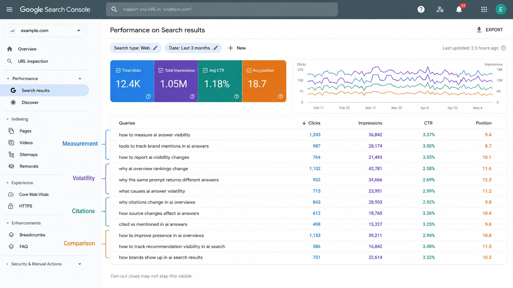
Google’s Search Console documentation explains how impressions, clicks, and position are reported in performance data. Google has also introduced generative AI performance reporting in Search Console, including visibility from AI Overviews and AI Mode.
That doesn’t mean every impression is an AI answer event. But Search Console can help you understand the query ecosystem around the answers you care about.
Look for these patterns:
- Long-tail informational queries
- Highly specific comparison queries
- Query clusters around cost, alternatives, reviews, and requirements
- Pages with impressions but low clicks
- New query patterns around the category
- Supporting subtopics adjacent to tracked prompts
Those signals can show which information surrounds the answer.
Some of this may not stay visible forever. As AI search products evolve, this intelligence may get harder to observe. Then, because this is how the world works, someone will probably package it and sell it back to you later.
So study what you can now: query fingerprints, supporting topics, and pages getting impressions even when clicks are low.
Even if not every impression is AI-driven, these patterns can help you understand the source ecosystem that shapes the answer.
Step 3: Compare the control
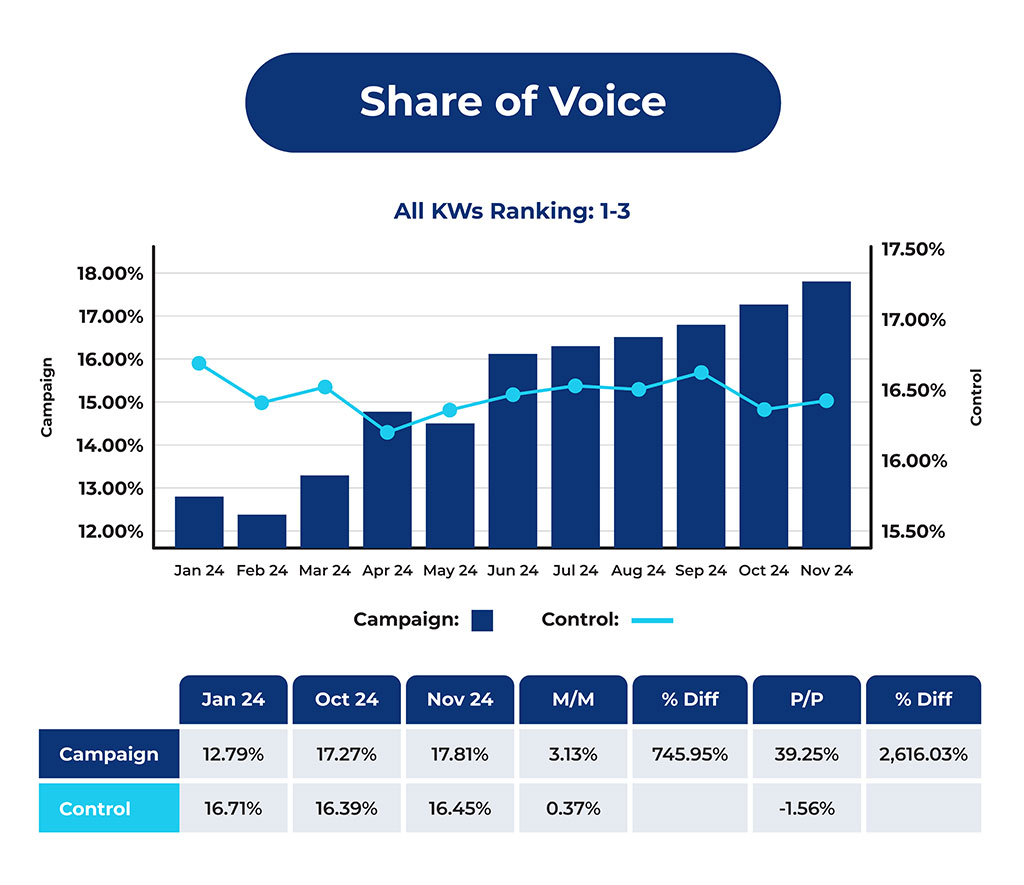
Before-and-after reporting can overstate gains when the whole category moves.
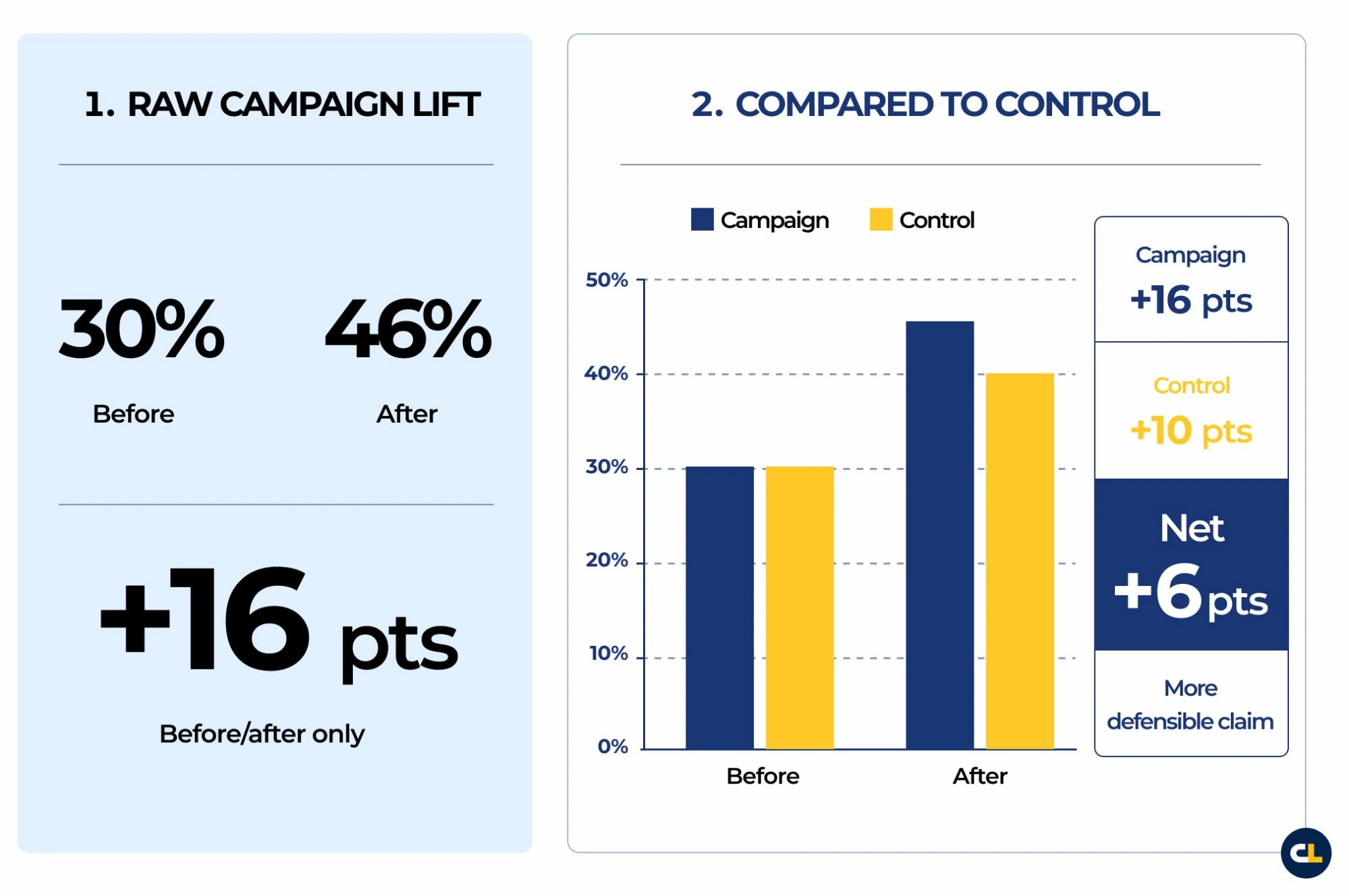
Say you measure a campaign prompt set before and after the work. Visibility starts at 30% and rises to 46%. That looks like a 16-point lift.
But you don’t yet know what you can claim.
If the control prompt set moved from 30% to 40% during the same period, the interpretation changes:
| Group | Before | After | Change |
|---|---|---|---|
| Campaign prompt set | 30% | 46% | +16 pts |
| Control prompt set | 30% | 40% | +10 pts |
| Net movement | +6 pts |
The campaign may still have helped. But the control changes the claim.
Instead of reporting a 16-point lift, you can say the campaign outperformed the control by 6 points.
That’s a very different (and much more credible) report. The raw lift tells you what changed, while the net lift tells you what you may be able to claim.
That’s the job of the control.
Even if presence and prominence improve, you still need to know whether the campaign set moved more than the normal category movement.
Otherwise, you may report category movement as campaign impact.
The repeatable AI answer tracking report
Once you have the framework, the report gets simpler.
A useful AI answer tracking report should answer seven questions:
- What layer did we measure?
- What happened to presence?
- What happened to prominence?
- What changed in the campaign group?
- What changed in the control group?
- What was the net movement?
- What should we do next?
You can build that report manually, in a spreadsheet, in Xofu, or with AI if you have the data and verify the outputs carefully. (The method isn’t tool-dependent.)
The report needs to answer the questions that keep the claim honest:
- What layer moved?
- How much did it move?
- Did it move more than the control?
- What should we do about it?
Then the diagnosis starts:
- If citation visibility is weak, the source ecosystem may need work.
- If mentions are weak, the brand association may be too weak.
- If the recommendations are weak, the brand may not meet the comparison criteria that shape the answer.
- If framing is weak, the answer may be pulling from outdated, incomplete, or misleading sources.
- If fan-out coverage is weak, the supporting content may not address the subtopics that shape the answer.
Your goal is to create a report that tells your team what happened, how confident they should be, and what to do next.
A lift isn’t a win until it beats the control
Otherwise, you may just be measuring category movement.
That doesn’t make the data useless, but you should be careful about what you claim.
Movement gives you a signal to investigate. Movement that beats the control gives you a stronger claim. Repeated movement across the right visibility layer, a stable prompt set, and a reasonable control gives you a much more credible story.
That’s where AI answer tracking becomes useful.
It won’t give you perfect certainty. But it gives you a disciplined way to observe the answer ecosystem, measure visibility, and separate likely progress from normal variation.
The framework is simple:
- Name the layer
- Presence vs. prominence
- Compare the control
If you can’t isolate the signal, you don’t have a win yet. You have a hypothesis.
That’s still useful. A hypothesis tells you what to test next.
If you want AI answer tracking to be credible with clients, executives, and yourself, you need to report better.
Not louder.
Better.